Hi Riya,
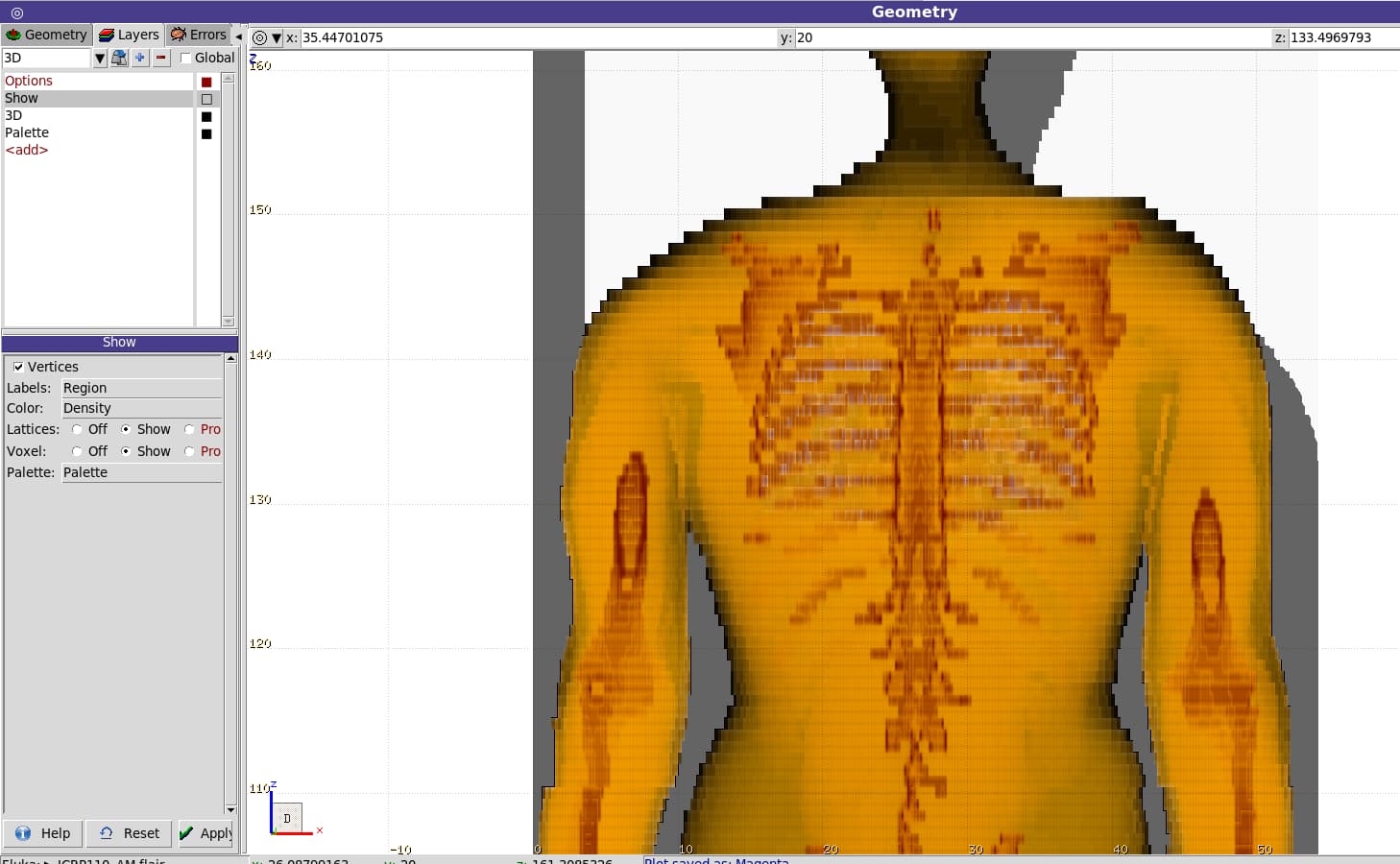
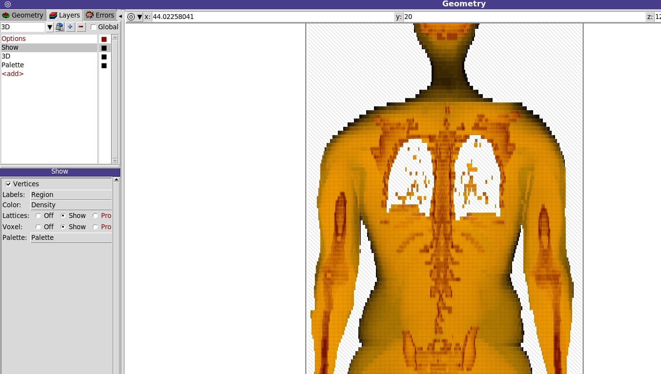
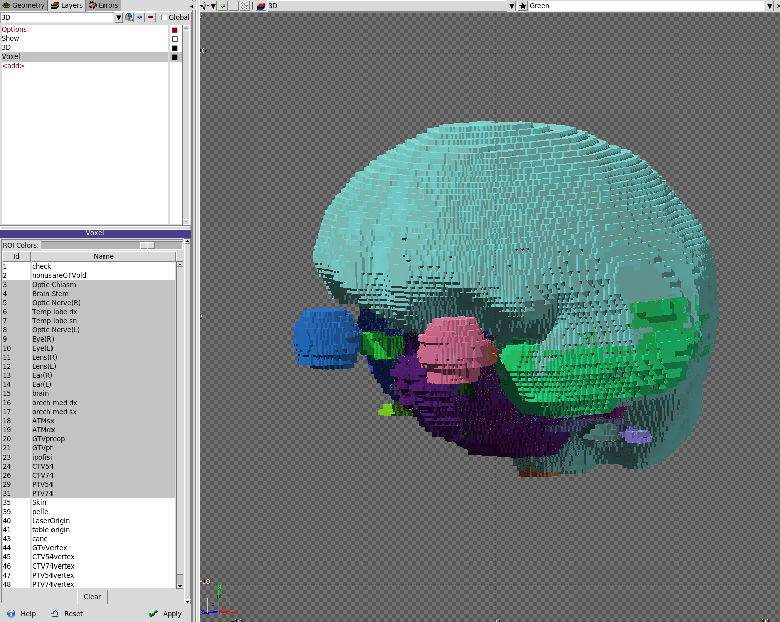
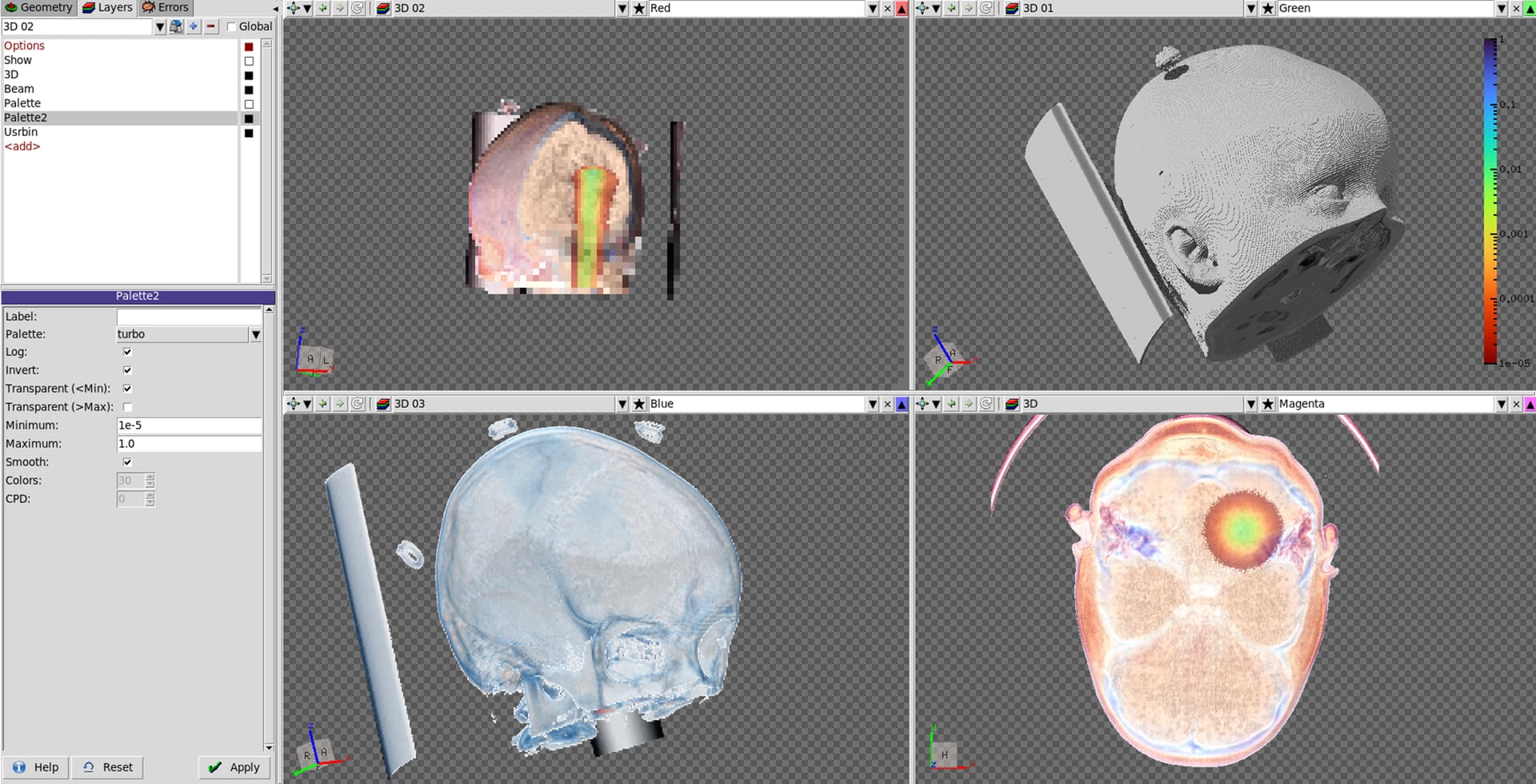
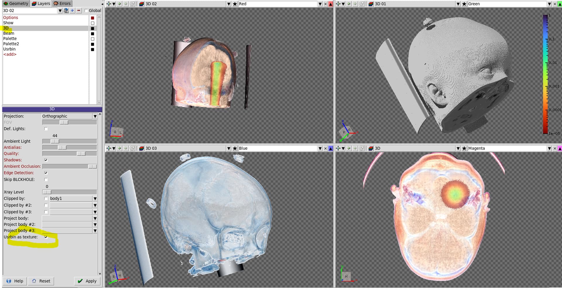
1.) The show option is used to configure some of the display parameters. I am not 100% sure what you are seeing in your pictures but it seems as if by your configuration in the show tab, you are overlaying the image of the medical renderer with some of the surrounding “region” geometry. As this is drawn only after the 3D image has been rendered, the rib-cage seems to disappear. In any case, overlaying 3D with 2D is a very specific use-case that most often does not make much sense and rather leads to confusion, while of course there are exceptions.
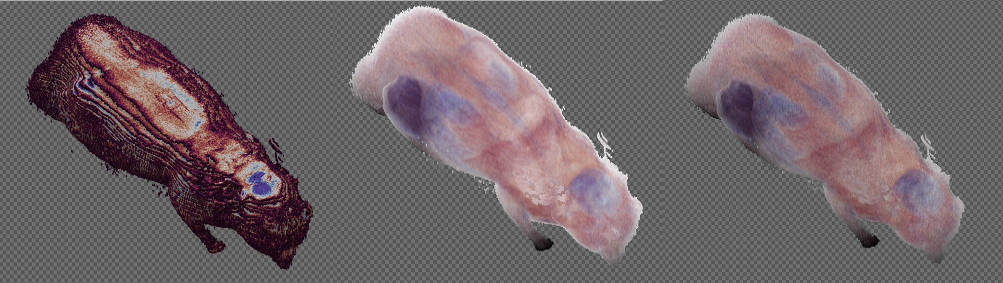
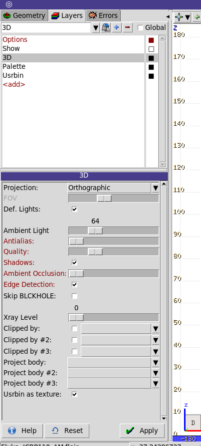
2.) Yes and no - to be more specific: in physical resolution one is limited by the resolution of the acquired image. One cannot get a better resolution than the voxel size from the original scan. However, during the rendering these voxels are reconstructed by shooting samples. Shooting more samples and interpolating in 3D on the data as well as their gradients allows for higher visual quality, but requires more rendering time. The medical renderer in farm supports a number of reconstruction algorithms which you can activate by moving the quality slider in the 3D settings tab to the right. Just try it out and you will immediately see the difference (see screenshot below, where the quality slider was moved one notch to the right, giving different images)
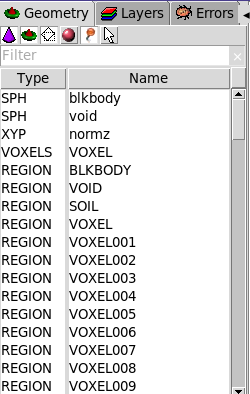
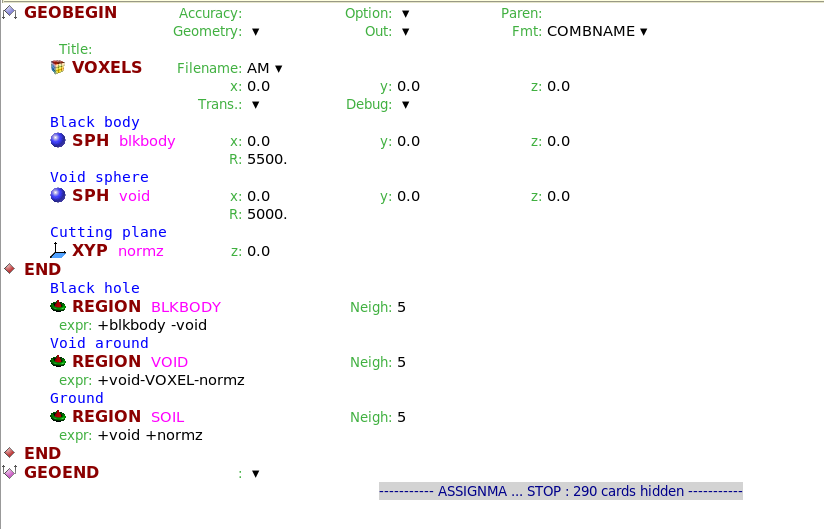
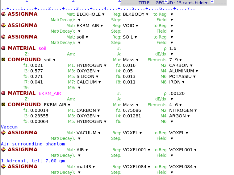
3.) - 6.)
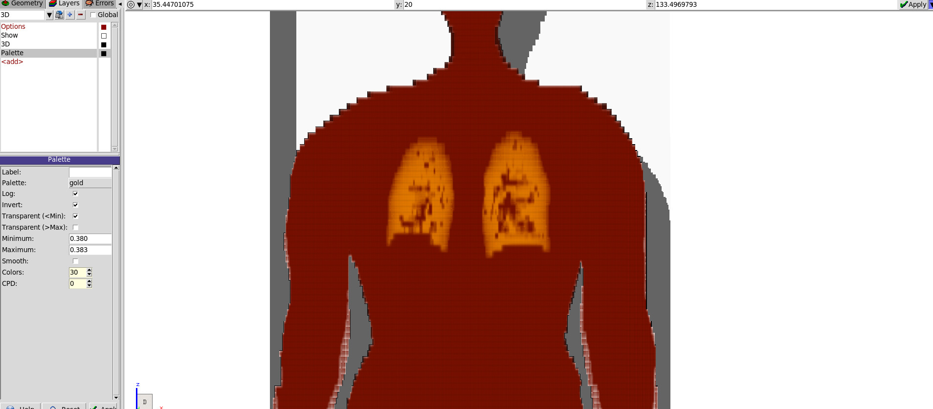
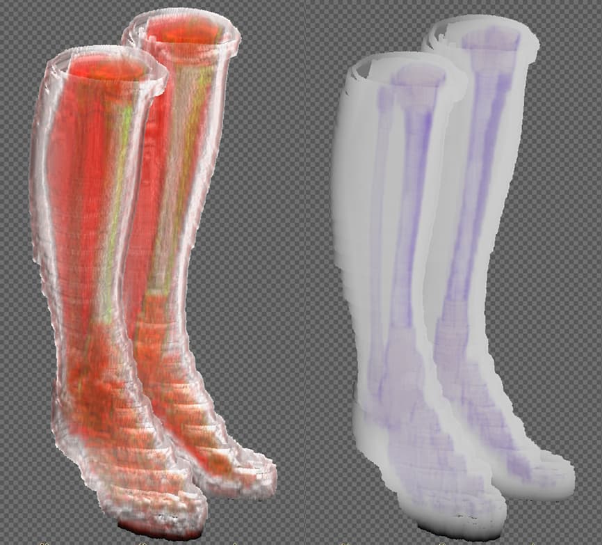
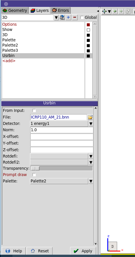
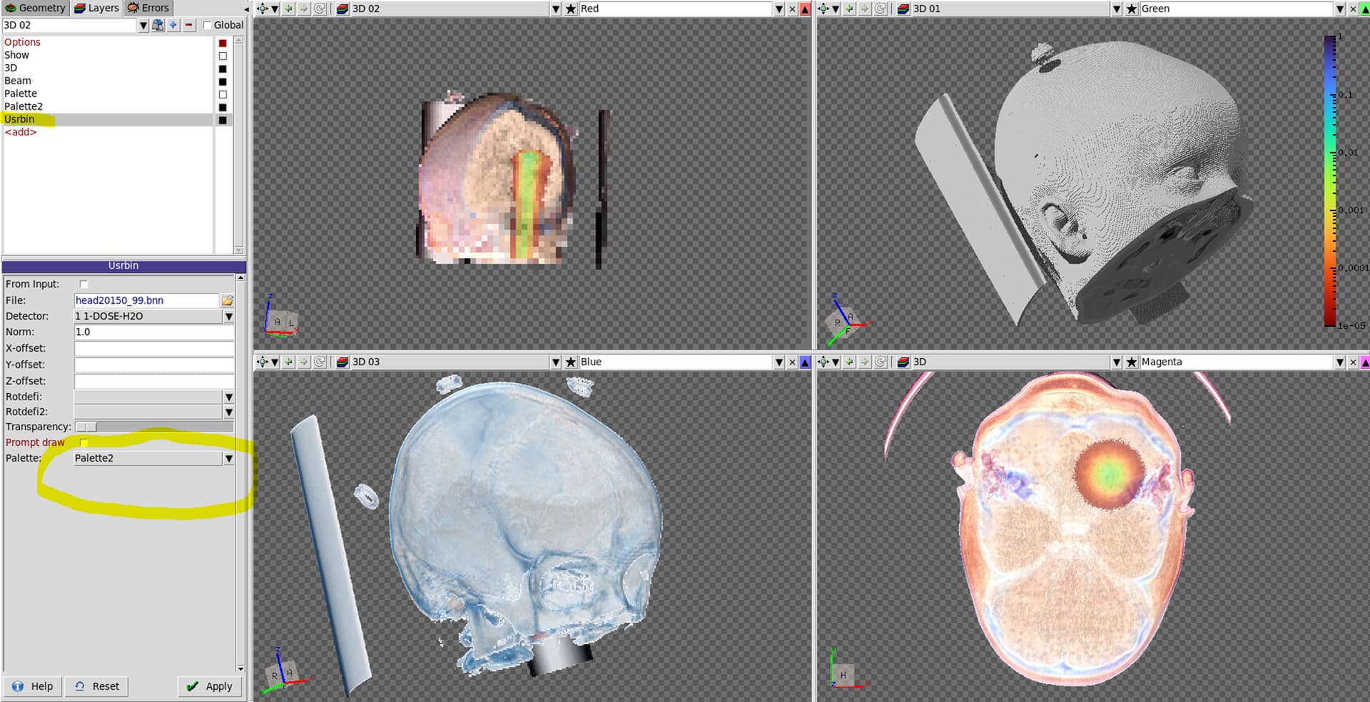
In medical imaging we reconstruct a 3D signal by mapping a color palette to a set of density ranges. So the minimum of the color palette is mapped to the minimum value that you state in the palette settings and the same is done for the maximum. By default values below the minimum value would still get the color of the minimum and for the maximum it’s similar. This is usually not what you want because for example in your data set you might have air, with a very low density, and you do not want to see that. So you should enable Transparent for < Min and Transparent > Max.
If you now change the minimum/maximum value to which the mapping is applied then the association of the colors will change. Imagine you have 30 (or however many) colors in your palette and you set the minimum to 0 and the maximum to 3. Then, every increase of 0.1 will result also in a change of a color. If, however you set the maximum from 3 to 6 then only an increase of 0.2 will result in a change of a color. So far so good, but now it becomes a bit more complicated still 
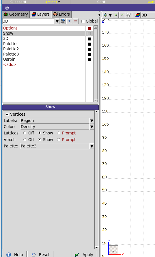
In medical imaging the mapping of the values is not only done towards a color but also towards a transparency level. For example dark colors might be opaque whereas light colors might be transparent. If you take a golden palette, choose the inverted option, then you will have dark brown colors for high values and light colors for low density values. Consequently, bones (which are dense) will be dark and opaque whereas fat tissue will be light yellow and transparent. Muscle tissue will be somewhere in between and this is what you see in your other pictures. However, a linear change from transparent to opaque is not always the best because you might have specific organs which are somewhere in between high and low density, which you might want to appear opaque as well and emphasize by a specific color.
Consequently, the combined choice of color palette, the selected min & max value and the transparency function determine what kind of tissue/organ and parts are shown and emphasized. This needs a bit of tuning and playing around, even for people who are professionals in the domain of medical imaging, and should be chosen on a case by case basis depending what the medical practitioner needs to have a look at.
For example this is the same dataset just using a different palette:
The absolute values in which your densities are given depend on your scan. But if it’s similar to the standard ones that I have seen so far, I would suggest to start setting the min to ~0.5 and the max to 2. Then I would start playing with different palettes to see which one gives you the best result for the type of body part that you would like to display. The next step is then to try different transparency transfer functions. For example for bones the default one with the golden palette works pretty well.
Try to change this transfer function by using the entry in the farm.ini file as explained in my original post. Using a value of 1, and palettes like “div” or twilight_shifted usually works quite well for soft tissue. Inverting a palette is usually quite helpful because normally they prefer dark colors for lower values but medical images are usually inverted - dark colors are good for high density objects.
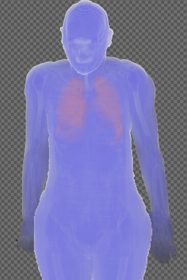
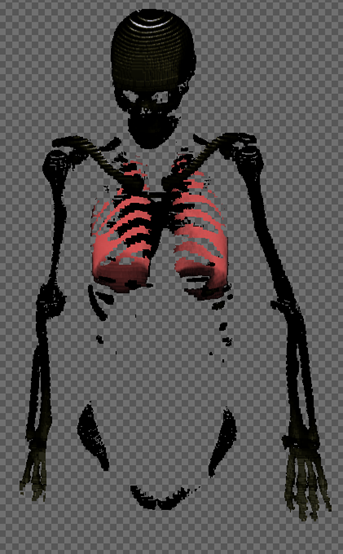
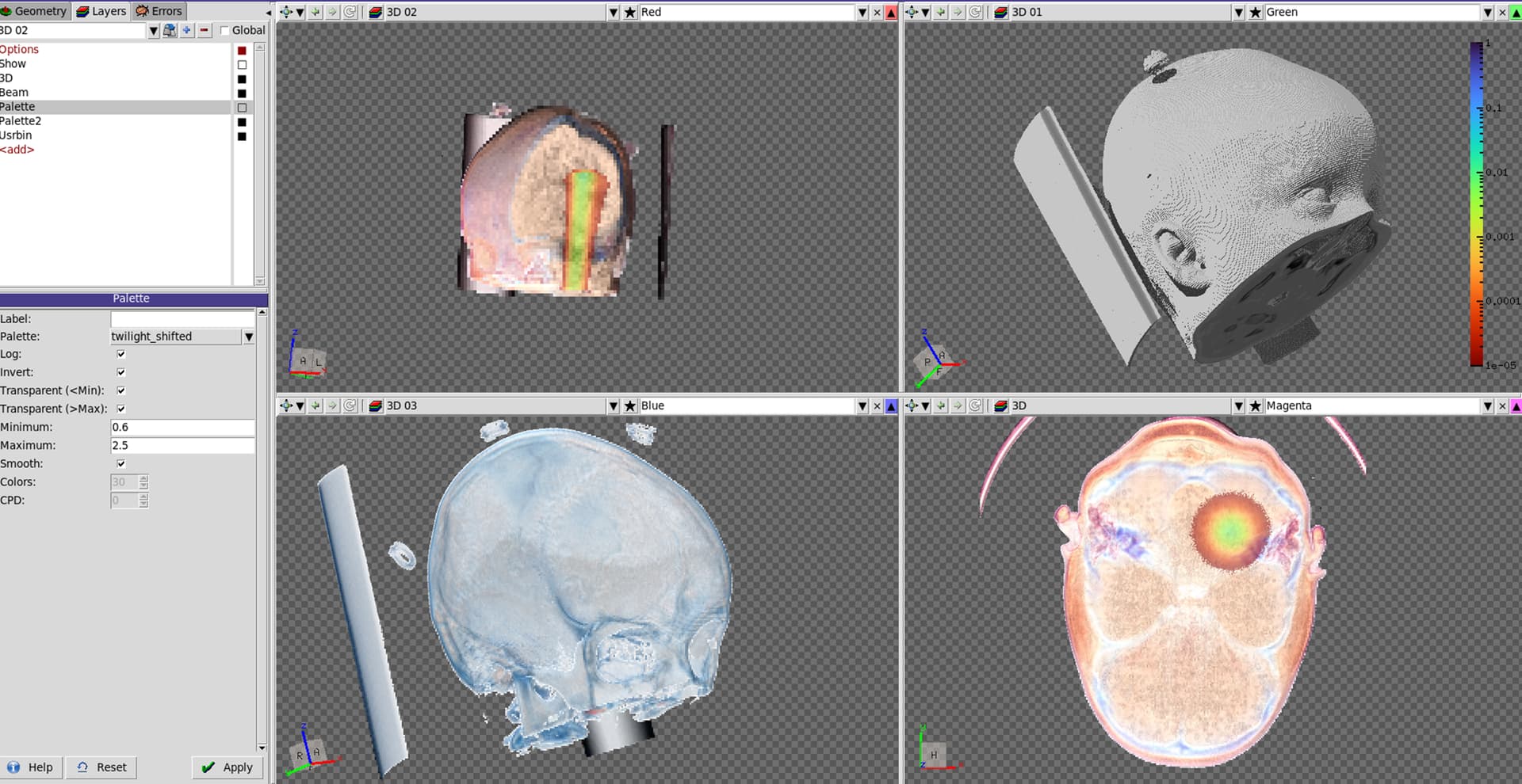
Let me illustrate this with an example from the ICRP phantom.
Palette: div
Transfer function: 1
Scaling: log, smooth, inverted
min 0.2, max 1.9
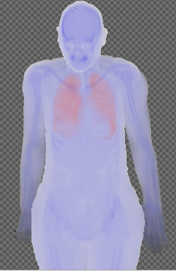
Palette: div
Transfer function: 1
Scaling: log, smooth, inverted
min 0.2, max 2.9
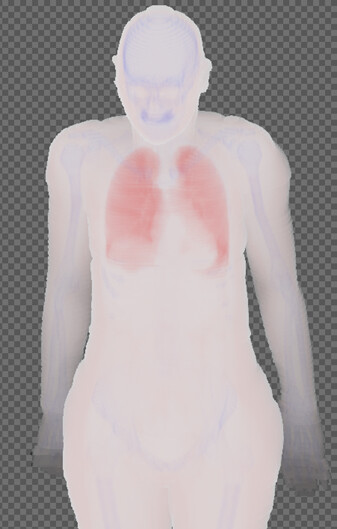
Palette: div
Transfer function: 1
Scaling: log, smooth, inverted
min 0.2, max 5.9
Palette: div
Transfer function: 0
Scaling: log, smooth, inverted
min 0.2, max 5.9
As I said, to get the best results one needs to play around with the parameters as it depends on how the data was recorded in the scan and what one wants to show.
Hope that helps
Chris